MIMS
Revitalizing the brand through digital transformation and multi-channel marketing
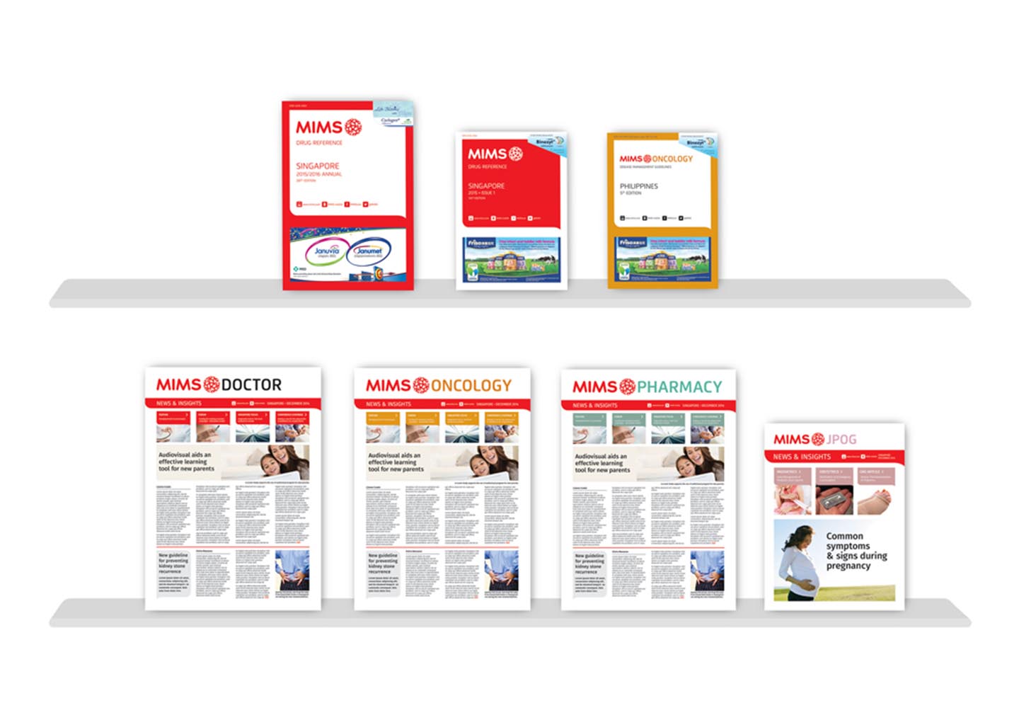
Healthcare Brands: Historically, MIMS is known as a medical drug directory but its offer has since expanded to news, insights & marketing support. Channel delivery has also expanded from published hard copy to multi-channel marketing. The branding project was an opportunity to realign the business & its users behind a new purpose, which was: ‘Empowering medical communities to improve patient outcomes’.
Marketing & Communications
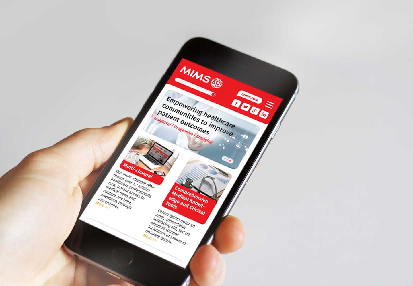
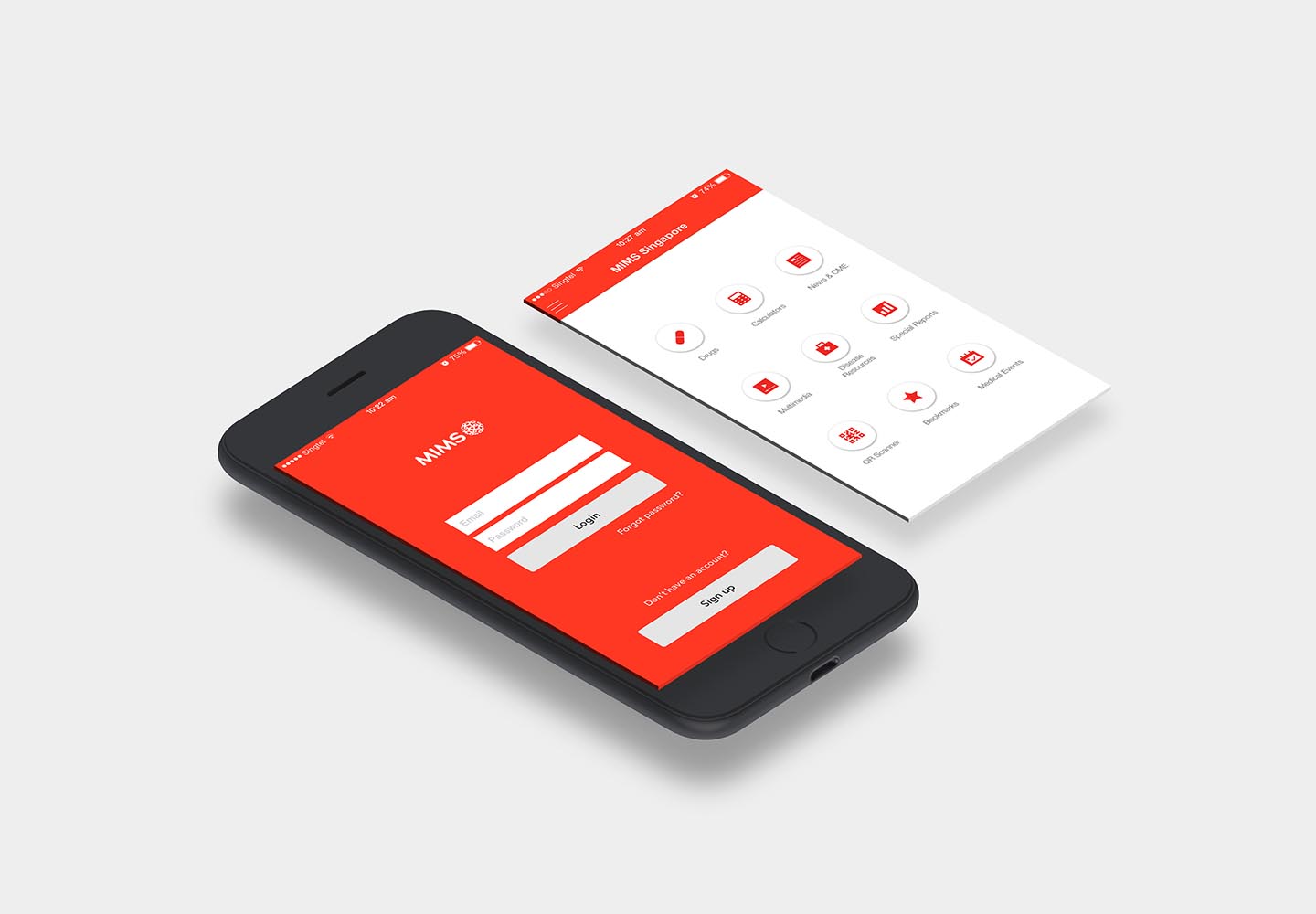
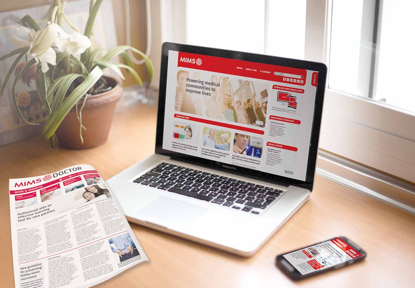
MIMS used the colour red extensively, but had little other visual equity. Tangible developed a complete visual & verbal system for the business. A new symbol reflected the purpose statement & aligned the different regional business names (MIMS, KIMS & SIMS). A verbal identity ensured the core values were written for various target audiences. Tangible developed the launch campaign for the refreshed brand and also designed a new corporate website for the group offer.

People & Culture
The purpose statement was specifically selected because of the ambition to inspire staff to see their role in ‘improving patient outcomes’ & supporting medical communities. Bringing this to life throughout the region is the next step in the journey.
Products & Services
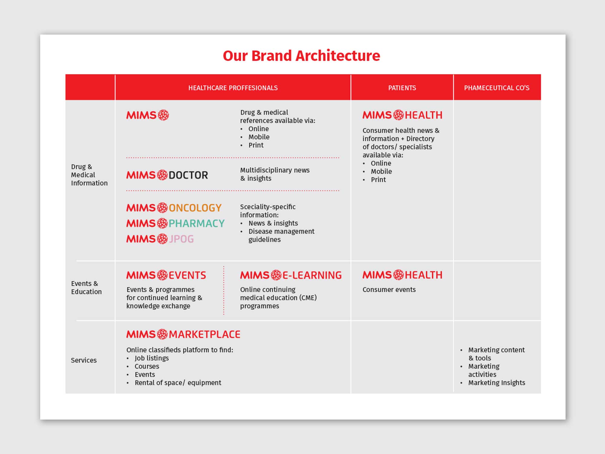
With a myriad of services, channels & target audiences, MIMS had become very difficult to explain clearly to anyone. Tangible developed a brand architecture to ensure that MIMS services were clearly defined and could therefore be clearly explained.
Spaces & Places
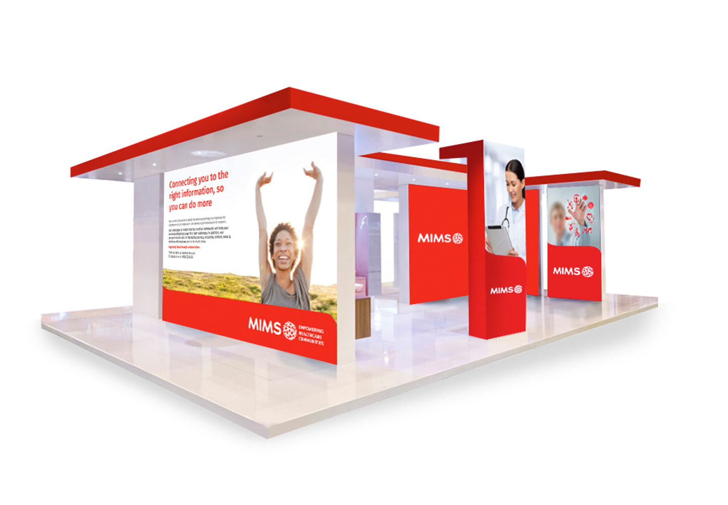
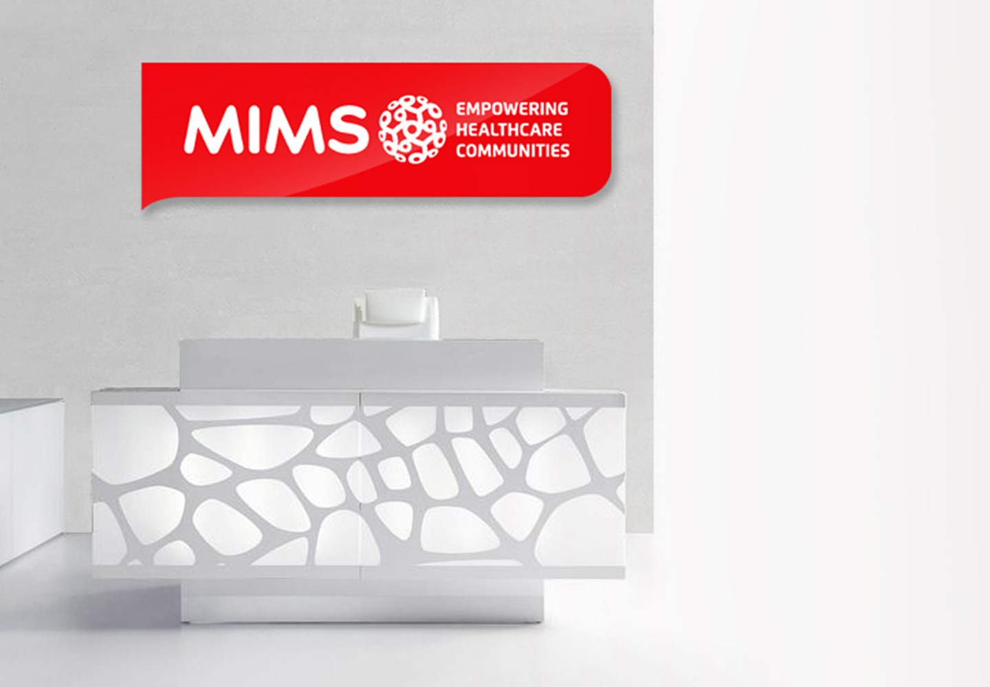
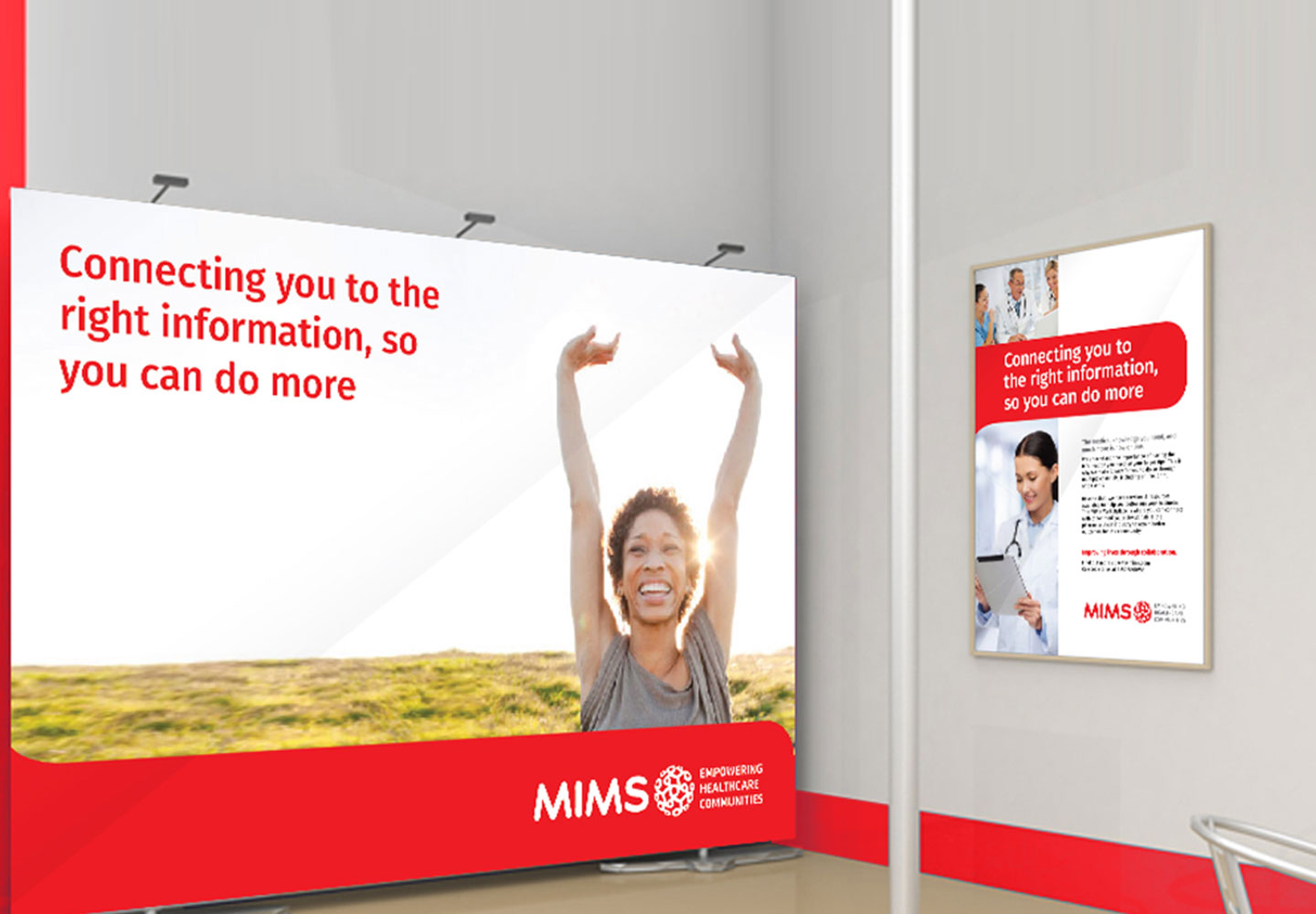
Tangible developed an exhibition design concept & reception signage for the rebranded business.
