Sage Hotels
Creating an Australian hotel brand that feels familiar
Hotel Brands: Sage, a new upscale hotel brand celebrating nothing in particular sounds unusual but Sage wanted to be the best ‘vanilla’ hotel experience; simplicity, familiarity and a consistency the target audience preferred.
Marketing & Communications
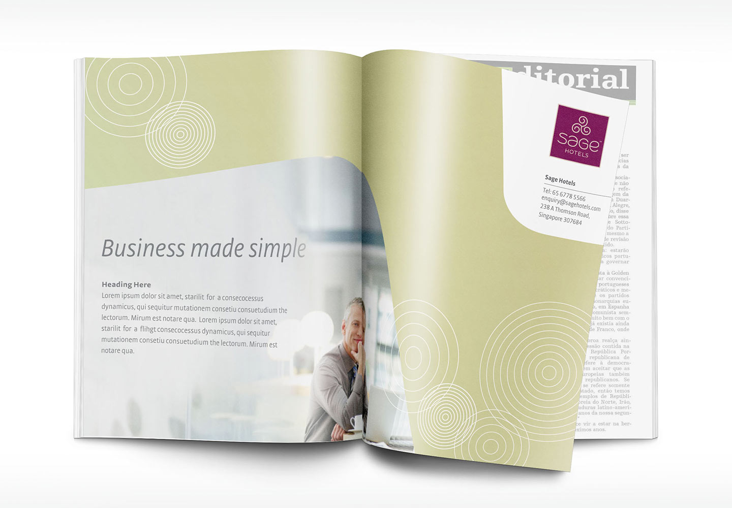
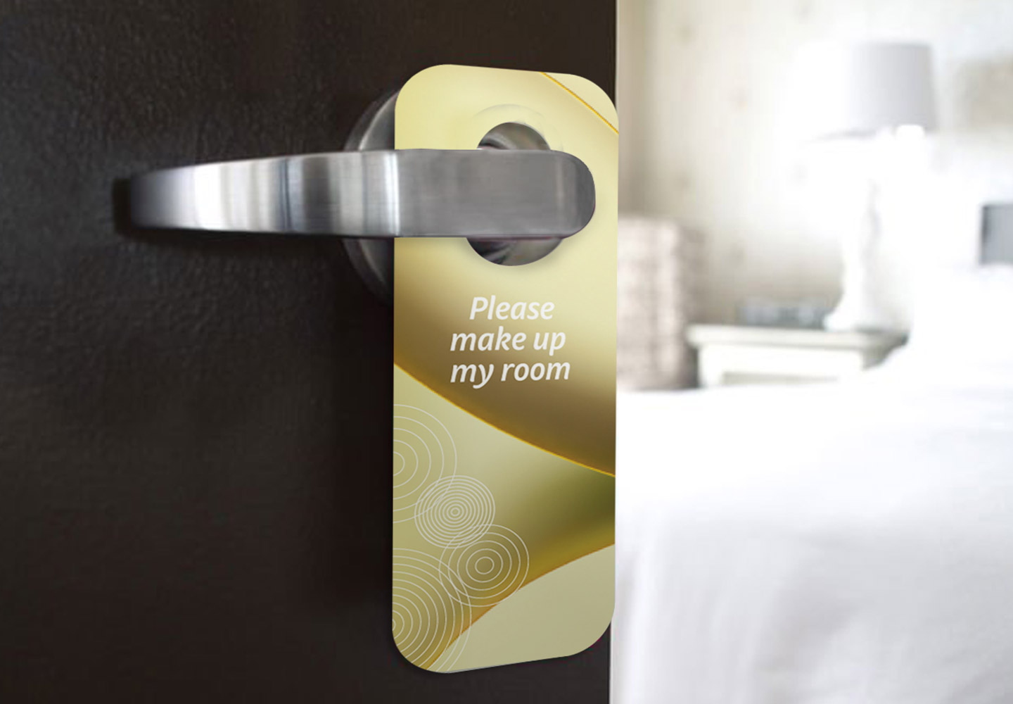
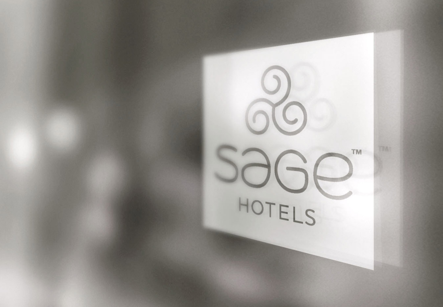
Both visual & verbal identities for Sage Hotels were designed to be reassuring and easy. The new identity was designed to give Sage Hotels a peaceful quality, that together with a graphic system that used natural pastel colours & soft shapes, created a calm & soothing effect. The verbal identity involved creating a messaging matrix using the brand attributes to write for differing target audiences, essentially the messages would ensure the various stakeholder would be reassured that at Sage Hotels they were in safe hands.
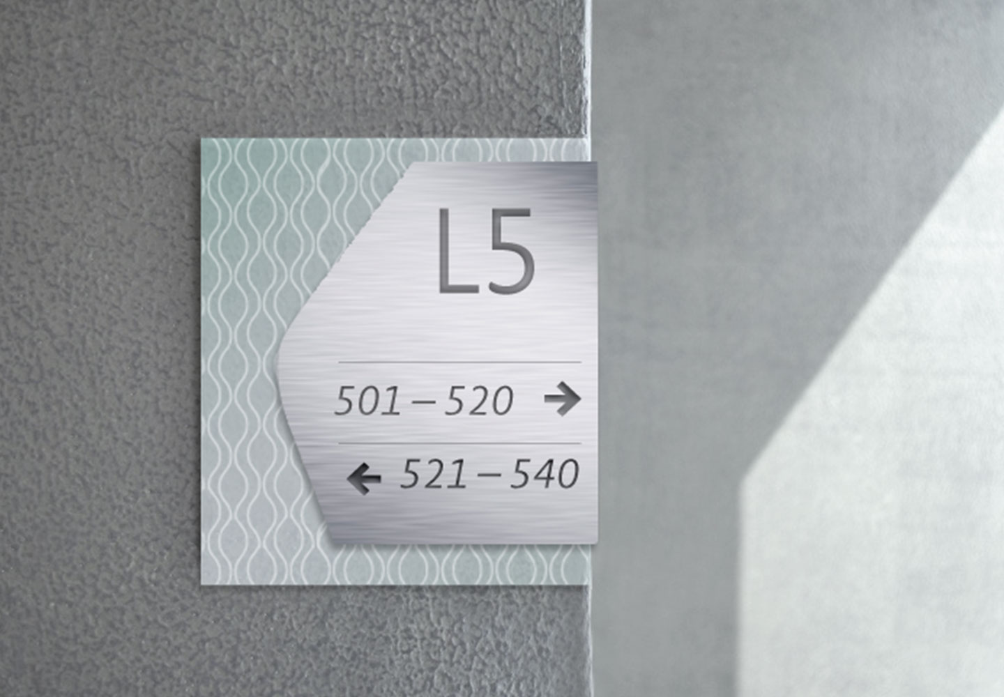
Frosted glass combined with a brushed finished aluminium would give the signage system a lightness that was in line with the brand positioning.
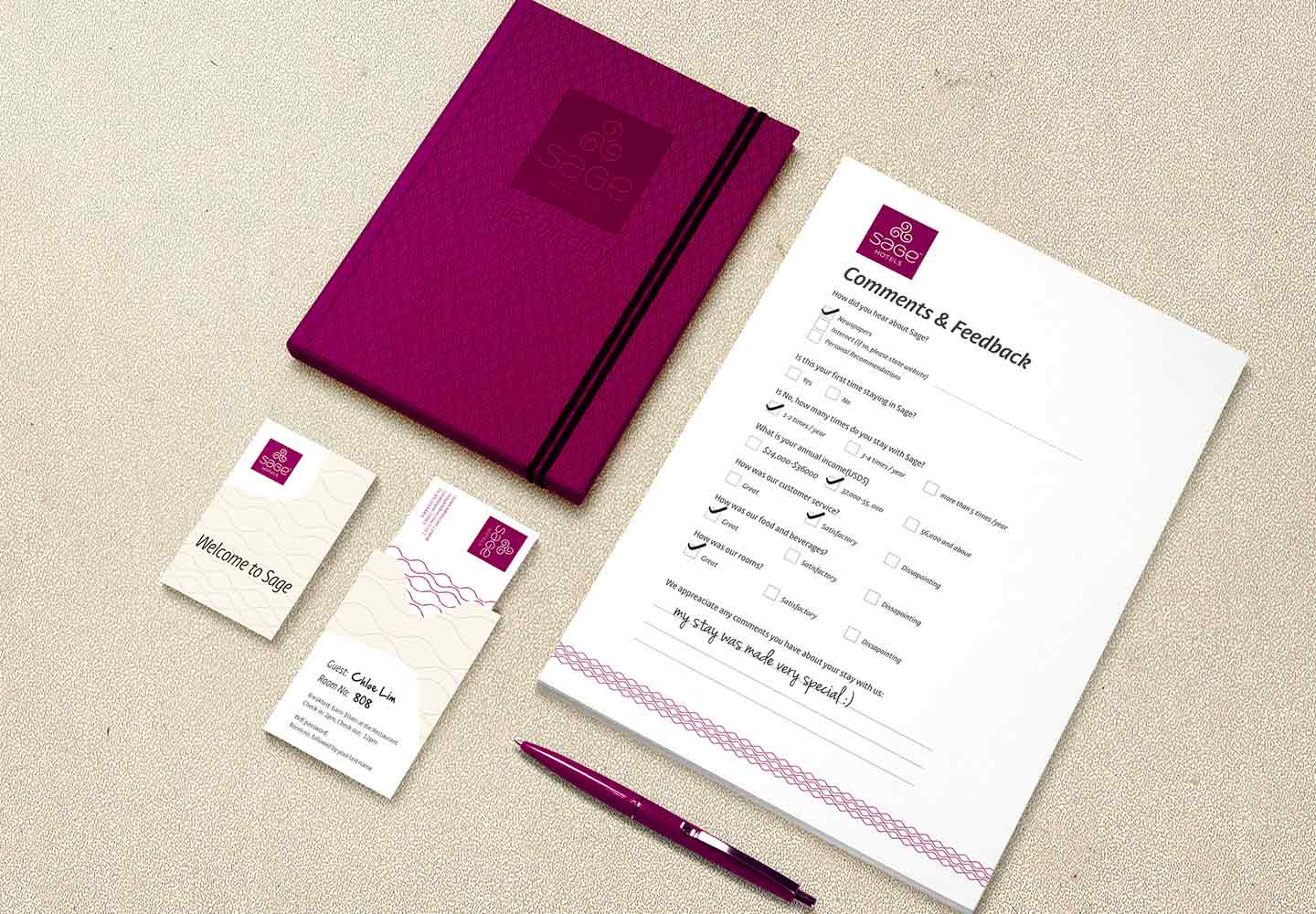
Patterns inspired by the lightness of nature, like wind and water droplets pepper the stationery and communications system.
