“Tangible has rejuvenated our brand positioning and contributed much in projecting our reputation to potential customers. Their concrete & practical recommendations have further enhanced our position in the market”
Jackie Liu, Principle & CEO
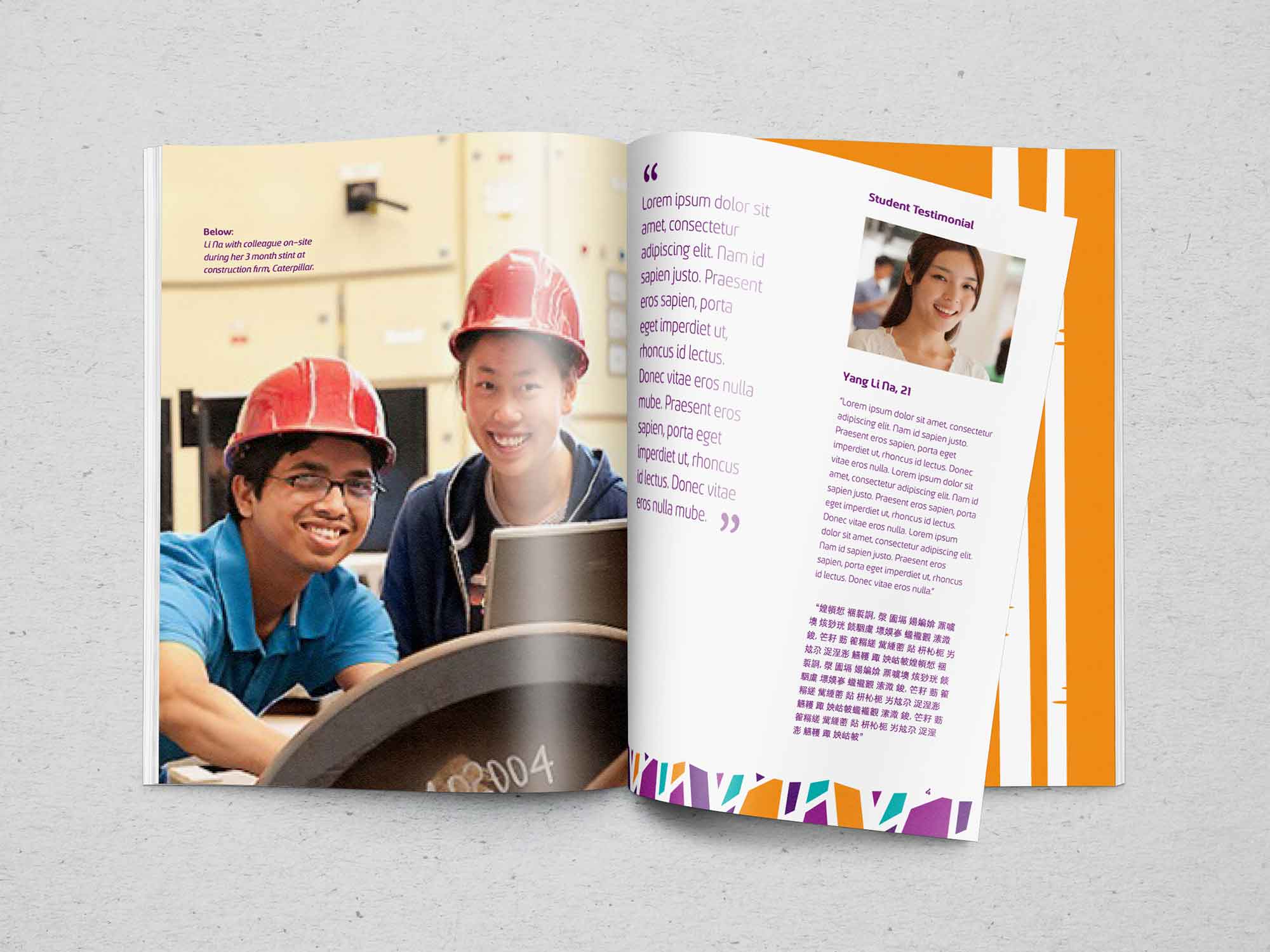
Education Brands: Barclyne College International was looking to position its brand for growth beyond its preparatory course focus in the past & to better communicate its education proposition. We helped define the purpose of the brand as one that offers an education that blends “practical knowledge” with “real world experience” & “character building values” to prepare students for success.
The Name Barclyne is derived from the Scottish word Barclay which means birch tree meadow. We used the distinctive pattern of birch tree bark to create the three stripes on the Barclyne shield (the 3 stripes reference the 3 ingredients from the purpose statement). The theme of the birch tree meadow was then used as a secondary graphic system across all Barclyne’s communications materials. Tangible then proceeded to refresh Barclyne’s entire visual & verbal identity system to align with the new brand.

Principles for guiding the behaviour of students & staff were defined to shape a campus culture that is aligned to the brand’s desired attributes.

New initiatives were defined to deliver a more enriching education by introducing more real-world exposure into the curriculum & creating a new framework for the school’s character-building programme, including defining activities to support these objectives.
A new campus look-&-feel was developed to guide its renovation together with ideas for features for its facilities, while wall graphics were developed to bring the brand to life & connect various zones within the campus.
Visit: Barclyne